Many people had wondered why and how graphic novel can be considered as art or design. What they don’t know is how word and image work together to incorporate the message or the main point of the story to the reader. For example Brian Fies, the author of Mom’s CancerWhatever Happened to the World of Tomorrow, and stress out this idea to give readers the feeling of what the characters are going through as the story progresses.
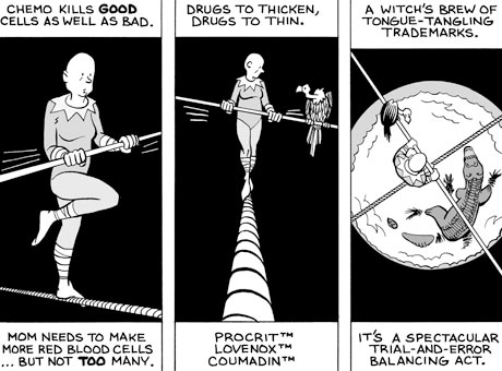
The image below from Fies’ comic Mom’s Cancer gives a demonstration of this idea. Fies’ comic is about his mother’s battle against cancer and the image above demonstrate a stage of what his mother was going through. The words in the panel explain the process and things his mother needs to go through and needs to do. Then in the panel each picture demonstrates a metaphor of how his mother really feels like, it’s to express and exaggerate the idea of the process to give the readers a better idea of how it really feels to be in his mother’s shoes. Although the words and pictures and the words are totally different from one another they both portray the same main idea of how it feels like to battle against cancer.
Today many companies are producing products that are more efficient and convenient for their customers. An example of one of the products that surprise me was the Flossup took picks. The idea of putting floss and toothpick together had never crossed my mind. The designer of these flossups is really creative to come up with that idea. The problem with floss is that it’s hard to floss the back teeth using your hands to hold on the string of floss. To make it more efficient and convenient floss was installed into the toothpick. So after picking your teeth, you can easily use the toothpick side as a handle to floss your teeth and can even get in hard to reach areas of the teeth.
The idea of using plastic as the toothpick is a great idea, because wooden toothpicks can break in between teeth and it would take another toothpick to get that piece out. For as plastic, it only twist and bends, also the plastic holds on more to the floss that was installed than wood. If the floss were to be installed into wood, the wood could easily break off and it would be a waste of the floss if you’re not fully done flossing your teeth with it. By using plastic, the floss and plastic toothpick can melt together and make a stronger hold than wood and a string of floss. This idea is very unique and well innovated that now more people prefer Flossups over wooden toothpicks or single string floss holding by hand.
In the video Objectified by filmmaker Gay Hustwit discuss the basics of designs and the principles of designs. In this film Hustwits interview many designers to get their point of view on designs and how they got the idea to do what they did. Hustwit interviewed Dieter Rams, a former design director in Braun Kronberg Germany, and in the interview Rams stated that only “a few companies that take design seriously.” The example he gives is the apple company. Hustwit also interview Jonathan Ive, senior VP Industrial Design Apple, where he discusses the form and content of how the company comes up with the design for Apple.
"Objectified" - Jonathan Ive talks about Mac design & Unibody MacBook manufacture
He explains about how Apple designs what is necessary and has a purpose to why something is there. If it does not have any function then it shouldn’t be there. All the parts in an Apple product have a reason for it to be put there; it was not put there just simply for its appearance. The form of a simple part of a MacBook gone through many different processes to get to its specific component, in which this component contributes to its content and how it works within the computer. They design it so the form that was created can work with the function inside the product, giving the best performances that were expected. Its content were design so it can easily be identify, such as the icons of the applications in an IPod, IPad, ITouch, etc… what makes it more amazing is that they’re all touch screen which makes it more efficient and convenient for the user of the product.
In the silent horror film, The Cabinet of Dr. Caligari (1920) directed by Robert Wiene, there is a good sense of form and content. The film starts off with the blue color atmosphere which conveys the feeling of a horror film. In colors, any variations of blue represent the sense of coolness. If an artist wants to portray a cold night in his/her painting, he/she would use the color blue. For as the variation of color from red to yellow portray the sense of warmth. To convey these feelings, the colors were incorporated in the film to bring out the creepy feeling at the beginning where the older man stated that there are ghosts around them. Without the blue coloring the viewer wouldn’t get the sense of coldness or feel the chill of the night. If it’s in pure black and white then the viewer can only rely on the words they see on the screen instead of feeling the cold night of the horror film.
Cold Night
Warm Evening
Not only does the toning of colors contribute to the sense of eeriness but also the setting. If it’s set in a plain smooth setting then it wouldn’t be as scary as a setting where there are bare tree and bushes. This keeps the audience guessing and wondering, where anything can suddenly emerge from the tree or from behind the bushes or can emerge from any angle and any corner of the screen.
The color suddenly changes from blue to yellow after it transition into a new event. This yellow color gives a sense of warmth, letting the viewer see that it is now day time. Along with the music and how the actors are acting, it contributes to the tense atmosphere, giving a sign that something is going to happen. Also the angle of the walls are diagonal, it emphasis a lot on the diagonal lines. If the buildings or walls are all vertical, the film would be boring and won’t give out the sense of uncanny which this film is suppose to be. The form and content of this film worked well together to convey the theme of horror to the audience with less dialogue and without spoken words.
I’m really fascinated with the idea of the vanishing tradition. Many people took what they have for granted. People get so lazy now that they leave everything to machines to do all the work for them, making it more convenient. Because of this that we now have vanishing tradition that can no longer be produce or look at again, it can’t even be replaced by machine.
For example, the designs of Chinese outfits in the 13th century and the 14th century cannot be made again because no one knows how to make it. Even people now can’t program machines to make it. The outfits then were all handmade and produce by people. Silk robes that emperors wore where made from the silk of silkworms, threading it all together by hand to make robes for the emperors. They are being less and less produced now with the fact that the older generation are getting older and are incapable and the newer generation or unwilling or unable to learn. It requires so much hard work that only a hand full of people in china still does it, others prefer machines.
These silk robes are so rare to see, worn, or produce that many of them have been preserve in museums or other archives to give the public an idea of how it looks like. Something so significant in the Chinese tradition and it is being forgotten so easily. The quality of it has been degraded instead of being improved. When you want to shop for a silk robe or a Chinese outfit, it’s rare to see an actually silk robe with complicated designs such as the old ones does. All you see today are machine printed or machine generated designs that are exactly alike. Meanwhile the actually handmade ones are more unique and different from what machines generated are like.
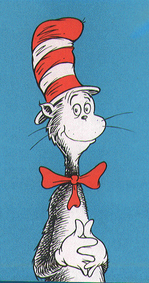
When I was a child, the books that caught my attention the most were the Dr. Seuss books. The illustrations and designs of the characters and the cover were so unique and detailed. The characters are unrealistic demonstrating the idea of fantasy and imagination. The human in the Dr. Seuss books were design out of proportion from the realistic human which makes it more enjoyable. The design of the Cat in the Hat was so well known that it became a signature like figure for the Dr. Seuss books. These books were design to help young children to learn counting, numbers, colors, etc… in a more intriguing way with the illustrations.
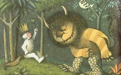
Another book that brings out the same idea of design as Dr. Seuss did is the book Where the Wild Things Are by Maurice Sendak. The design of the cover portrays a huge creature sleeping in the forest as a small boat is approaching from the sea. The creatures are unrealistic and just help convey the idea of imagination and fantasy.
What these two authors and illustrators have in common is that both of their book designs have the same goal, bring out imagination and fantasy in a child. The characters in the books look hairy and surreal. The characters are also personified, giving a voice to every character so they can communicate with one another in the story. The contrasts of these two designs are that Dr. Seuss’ designs of his characters are more abstract than the design of Maurice Sendak. Sendak’s designs are more precise and detailed, catching the characteristics of a real creature or a real person more accurately. Meanwhile Dr. Seuss characters are abstract and the creatures that are being portray looks more cartoon.
Design is a conversation between the designer and the customer or whoever that is interested in the design. It is use to communicate the designer’s ideas of their design and how it works to the person of interests. Or it can be a conversation between the design itself and a designer. The old design may be tempting the designer to make it more new, more advance, and more capable than it was before. If it’s as conversation between a designer and its customer then the designer is trying to convince the customer to pay attention to it and to purchase it.
The design of things will keep advancing from what was made before or in the past. Such ask bell bottoms becoming boot cut jeans, skinny jeans becoming more skinny and tighter, type writers becoming computers, computers advancing to a higher degree, black and white photo turns to colors, color photos becoming high quality, then becoming three dimensional, etc…. Design will keep on rolling and advancing from past designs. Each time a design is innovated or changed into something more advance it is because the design needs to be upgraded and tempt the designer to improve it. The designer wants to improve it to satisfy the audience or customers. Telling them this “new” designer is better than the old one in many ways. In which leads to advertising and how the design of advertising works. How it is thought out, how the designed product itself says so much in an advertisement without anyone saying “this is much better than what it was before.The video below is an example.
Of course the design of advertisement is to convince the audience into purchasing the product that is being advertised. Even when seeing something for the first time and testing it out for the first time, the first question that comes to mind is “why is it design like this?” It could easily be figured out after testing it out that it was design this way or that way because of this or that to make it work. That is how the design start a conversation with whomever it is that try to figure it out.
The way how design is a conversation with the designer is, the designers can it in a different way from what it is. The designer can make changes to it and make it different from what it seem to be what it is. Just like an illusion, something may appear to be as it is, but turns out to be something else. That is an idea of design, telling us that it is more than what it seems to be. How design communicates to innovate from one thing to another is up to the designer to see if they can see what can be improve. The video below demonstrate and illusion of design and how many objects around us can be design into thing that seem to be one thing but is another. In the video the CD looks like they are spinning in which they are not, it seem to be basically the light reflecting on the CD which makes it look like its spinning.