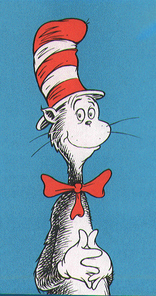
When I was a child, the books that caught my attention the most were the Dr. Seuss books. The illustrations and designs of the characters and the cover were so unique and detailed. The characters are unrealistic demonstrating the idea of fantasy and imagination. The human in the Dr. Seuss books were design out of proportion from the realistic human which makes it more enjoyable. The design of the Cat in the Hat was so well known that it became a signature like figure for the Dr. Seuss books. These books were design to help young children to learn counting, numbers, colors, etc… in a more intriguing way with the illustrations.

Another book that brings out the same idea of design as Dr. Seuss did is the book Where the Wild Things Are by Maurice Sendak. The design of the cover portrays a huge creature sleeping in the forest as a small boat is approaching from the sea. The creatures are unrealistic and just help convey the idea of imagination and fantasy.

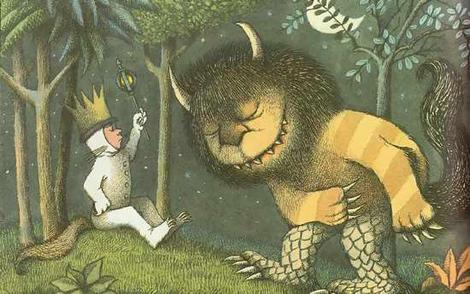
What these two authors and illustrators have in common is that both of their book designs have the same goal, bring out imagination and fantasy in a child. The characters in the books look hairy and surreal. The characters are also personified, giving a voice to every character so they can communicate with one another in the story. The contrasts of these two designs are that Dr. Seuss’ designs of his characters are more abstract than the design of Maurice Sendak. Sendak’s designs are more precise and detailed, catching the characteristics of a real creature or a real person more accurately. Meanwhile Dr. Seuss characters are abstract and the creatures that are being portray looks more cartoon.
No comments:
Post a Comment